Pizio Tech
Designing a modern web presence focused on clarity, trust, responsive usability, and conversion-focused user paths.
A digital presence designed to feel modern, clear, and conversion-focused.
Pizio Tech is a web design and digital solutions brand focused on helping service-based businesses improve their online presence through modern websites, lead generation systems, and responsive user experiences.
The goal of this project was to create a polished digital experience that communicated professionalism, modern design capability, and conversion-focused thinking while maintaining a clean and approachable user flow.
- Create a modern and visually polished brand presence
- Clearly communicate services and capabilities
- Improve navigation and information hierarchy
- Build trust through layout, typography, and structure
- Optimize the experience for desktop and mobile users
- Guide users toward clear calls-to-action without overwhelming the interface
I handled the project from strategy and layout through front-end implementation.
Because this project represented my own digital design brand, I was responsible for both the creative direction and the practical build decisions behind the site experience.
Balancing visual polish with simple, usable structure.
Because the website represented a digital design business, the interface needed to feel visually engaging while still remaining intuitive and easy to navigate.
Making complex services feel easy to understand
One of the primary challenges was simplifying multiple service offerings into a structure users could quickly understand without excessive scrolling or information overload.
The site also needed to perform well responsively across mobile devices, where many service-business users initially discover websites and decide whether to continue engaging.
Key decisions focused on clarity, hierarchy, and user action.
Each design decision was made to help users quickly understand the brand, evaluate the services, and move toward a clear next step.
Simplified navigation
The navigation structure was intentionally kept minimal to reduce cognitive load and help users quickly locate key sections of the website.
Strong visual hierarchy
Typography scale, spacing, and section structure were designed to guide users naturally through the page while emphasizing important actions and information.
Conversion-focused layouts
Calls-to-action were strategically positioned throughout the site to create clear paths toward contact and engagement without making the experience feel overly sales-driven.
Responsive mobile experience
Mobile spacing, content stacking, button sizing, and readability were considered to keep the experience clean and usable across devices.
Brand identity and color direction
A teal, charcoal, and white color palette was used to create a modern technology-focused aesthetic while maintaining readability and visual contrast.
Trust-building content structure
Service sections, benefit-focused copy, and clear page flow were used to build credibility and help users understand the value of the brand quickly.
Built for responsive presentation and future scalability.
The website was designed and developed using Webflow with custom front-end styling and integrations where needed.
The final structure was built to support future service pages, portfolio expansion, brand updates, and conversion-focused content changes.
Implementation included
- Responsive page structures
- Custom animations and interaction details
- Optimized layouts for multiple screen sizes
- AWS hosting and deployment workflows
- Cloudflare DNS and performance configuration
Both Desktop and Mobile focused designs.
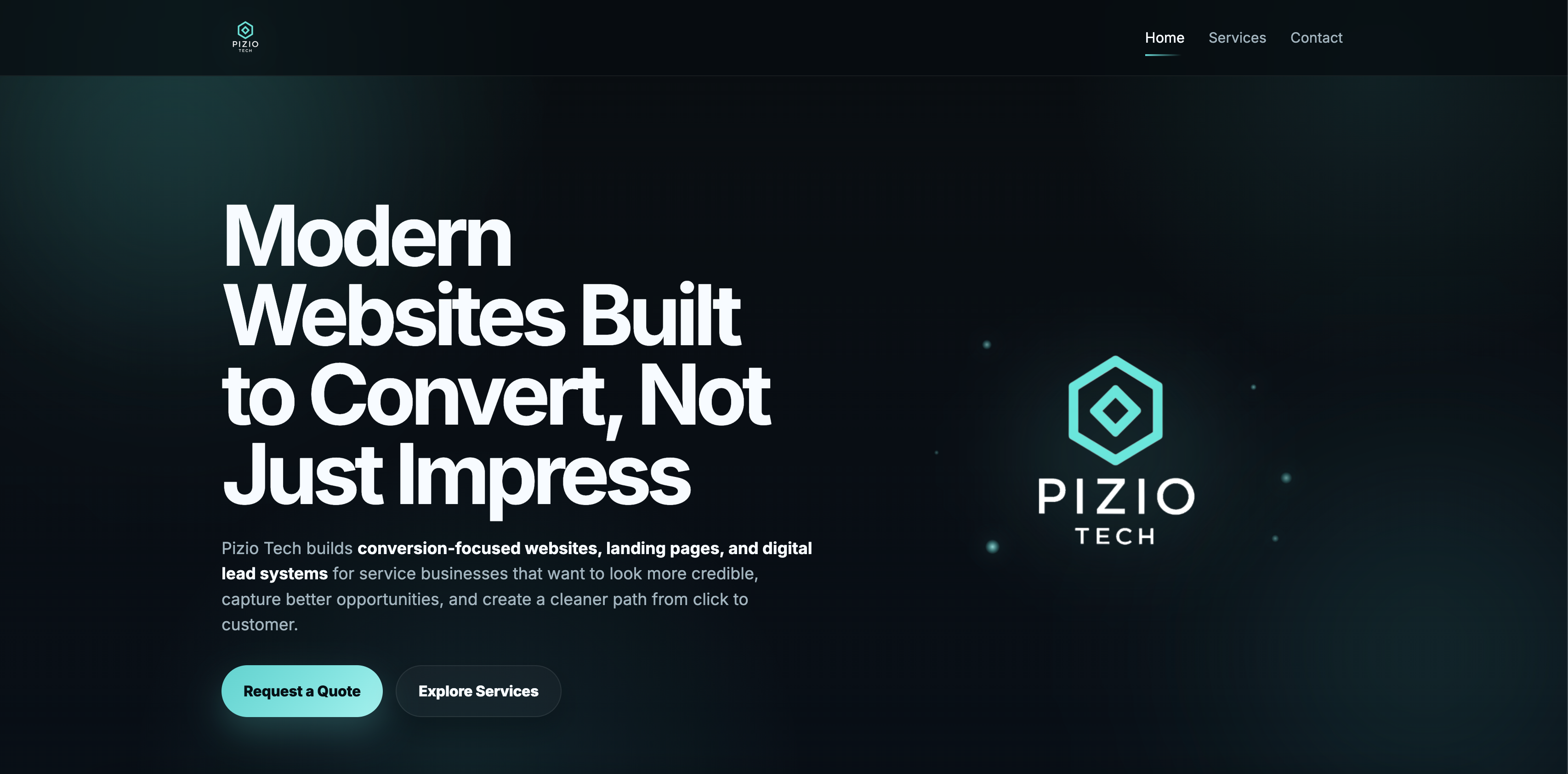
Homepage Hero / Landing View
Modern desktop presentation focused on visual hierarchy, branding clarity, and conversion-focused user flow.
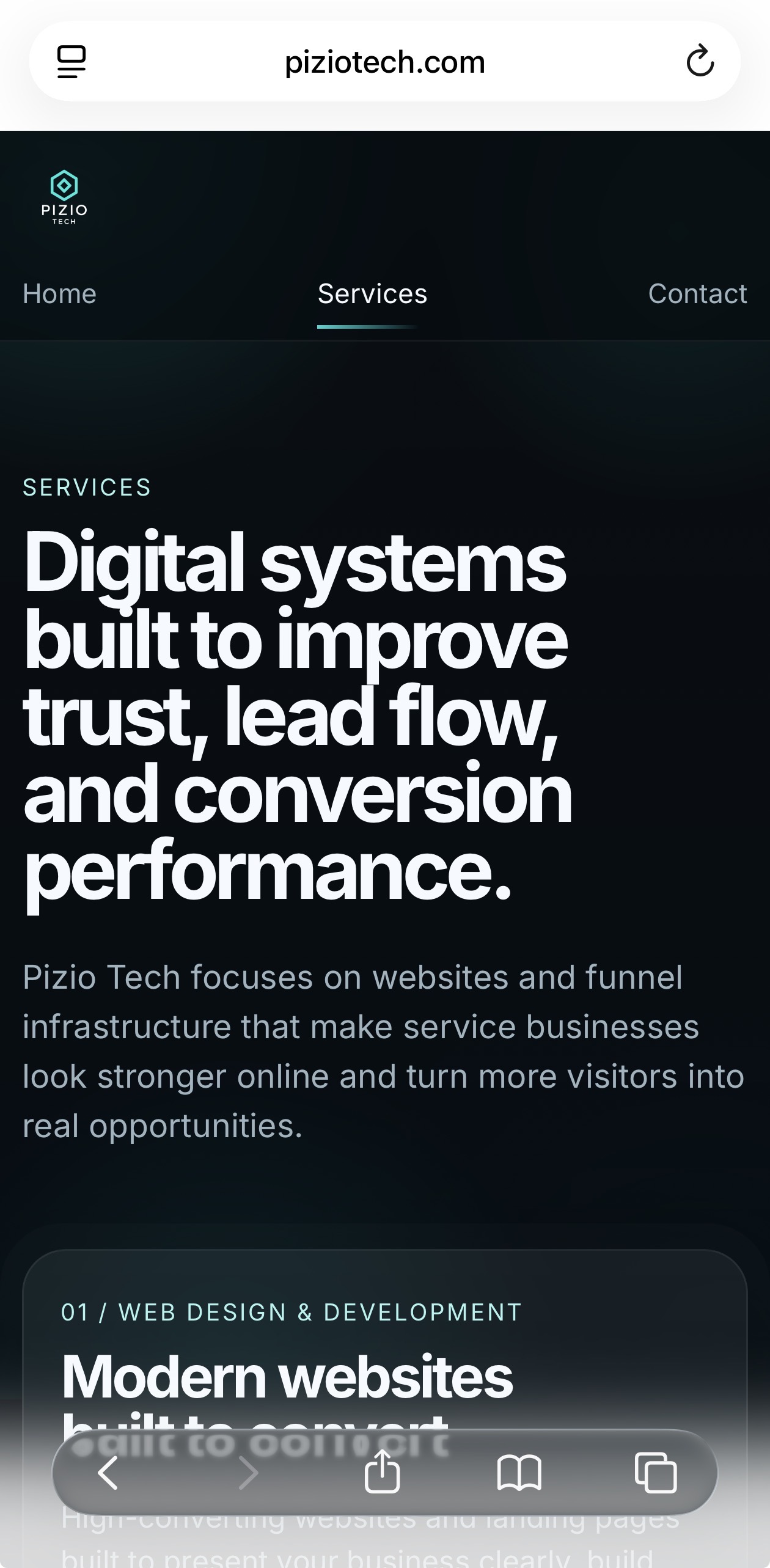
Responsive Mobile Layout
Mobile-first spacing, responsive stacking, and simplified navigation optimized for readability and engagement.
A stronger digital foundation for the brand and future portfolio work.
The final result was a cleaner and more professional digital experience that better represented the brand’s modern positioning and design capabilities.
The project also established a scalable foundation for future portfolio work, client presentation, and service expansion while reinforcing core UX principles such as clarity, responsiveness, and user-focused navigation.
- Clearer service positioning
- Stronger responsive experience
- Improved visual consistency
- More intentional paths toward contact