Select Insurance Plans
Redesigning a health insurance landing page to capture high-intent leads through a simplified form experience, clearer messaging, and a mobile-first conversion path.
A streamlined landing page built to turn high-intent visitors into qualified leads.
Select Insurance Plans is a health insurance lead-generation website designed to help users request information about private health insurance options through a simple landing page form.
The project focused on reducing distractions, simplifying the form experience, and presenting the page in a way that felt clear, trustworthy, and action-oriented for users actively searching for coverage options.
- Create a simple, high-converting landing page experience
- Capture high-intent leads through a focused form flow
- Reduce unnecessary content and decision friction
- Make the page easy to use on mobile devices
- Communicate the offer clearly and quickly
- Support future FAQ, compliance, and organic search content
I redesigned the page around the user’s intent: get help quickly and submit the form easily.
The project required balancing conversion-focused design with clear messaging, trust-building, mobile usability, and a clean form experience.
Collecting enough lead information without making the form feel overwhelming.
Health insurance lead forms need to gather important qualifying details, but asking for too much too soon can create friction and reduce completion rates.
Designing for users already searching with intent
The page needed to respect the mindset of users who were likely comparing coverage options and looking for a quick path to help.
The challenge was creating a landing page that felt focused and credible without overloading visitors with excessive sales copy, too many links, or distracting sections before the form.
Key decisions focused on form completion, clarity, and mobile usability.
Every page element was evaluated around one primary question: does this help a high-intent user understand the offer and complete the form?
Form-first landing structure
The landing page was simplified so the form remained the primary action instead of being buried beneath long informational sections.
Focused field selection
The form was structured around the most relevant lead details: name, contact information, zip code, age, household income, and insurance type.
Reduced visual clutter
Supporting content was kept concise to prevent users from getting distracted before submitting their information.
Mobile-first form usability
Inputs, spacing, and button sizing were designed to make the form easier to complete from a phone.
Clear CTA language
The call-to-action was written to feel direct and practical, helping users understand what happens next after submitting.
Support for trust and compliance content
The broader site structure allowed for privacy, terms, disclaimers, FAQ content, and informational pages without distracting from the core landing page.
Built to support landing page traffic, form submissions, and future organic growth.
The redesigned page was implemented as a responsive static website with custom form behavior and a clean conversion path.
The structure also created room for additional FAQ pages, privacy/legal pages, and AEO/SEO-supportive content without compromising the directness of the main landing page.
Implementation included
- Responsive landing page layout
- Lead-capture form structure
- Mobile-friendly input and button sizing
- Thank-you page conversion path
- Supporting privacy, terms, and disclosure pages
Designed to be Mobile First, but not forget about desktop experience.
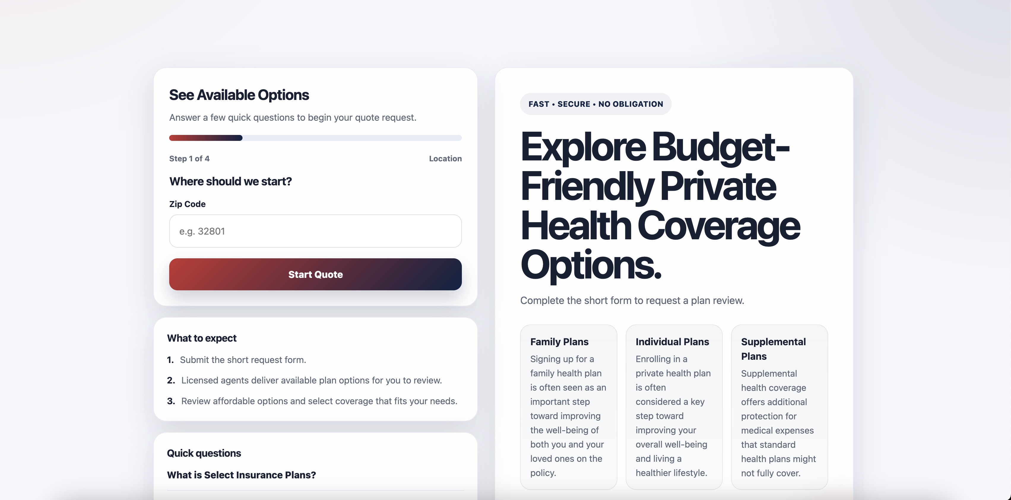
Landing Page / Form-First Layout
Desktop presentation focused on keeping the form visible, the message clear, and the conversion path simple.
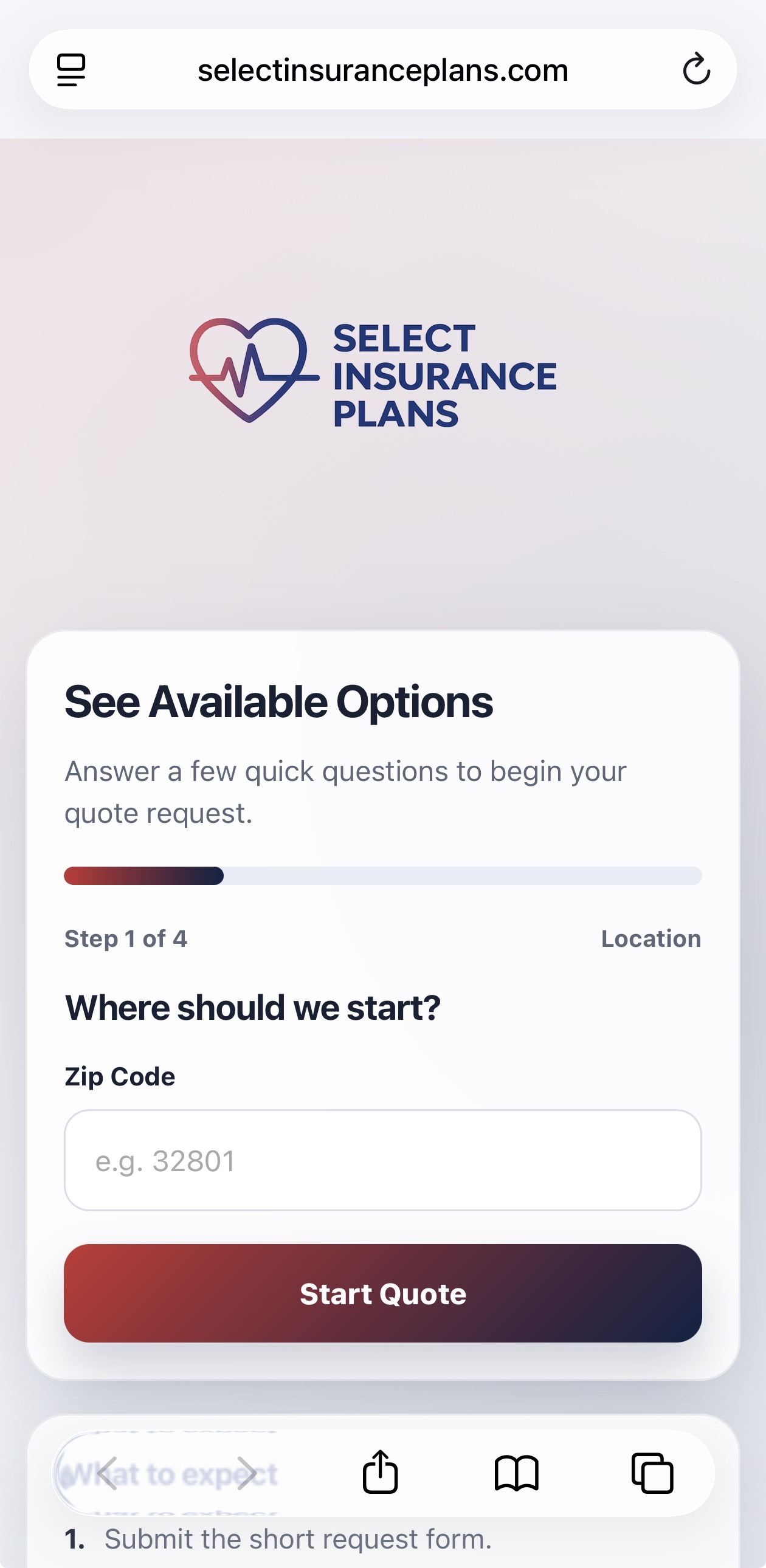
Mobile Lead Capture Flow
Mobile-first form spacing and CTA placement designed for users completing the request from their phone.
A more focused landing page experience built around high-intent action.
The final result was a cleaner, more direct landing page that aligned the page structure, messaging, and form experience around a single core user action: submitting a quote request.
The project strengthened the overall lead-capture experience by simplifying the page, reducing friction, improving mobile usability, and creating a structure that could support future informational and compliance content.
- Clearer landing page focus
- More streamlined form experience
- Improved mobile usability
- Stronger support for paid and organic traffic